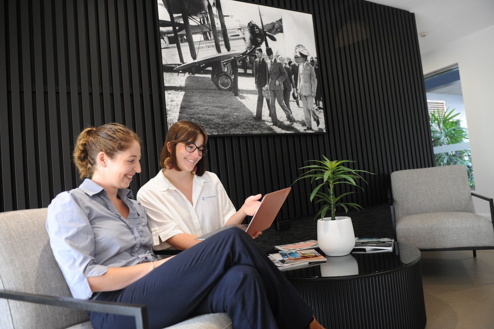
Up and away at Darwin Airport
Darwin International Airport is one of the most visited sites in the Northern Territory
So how did we get there?
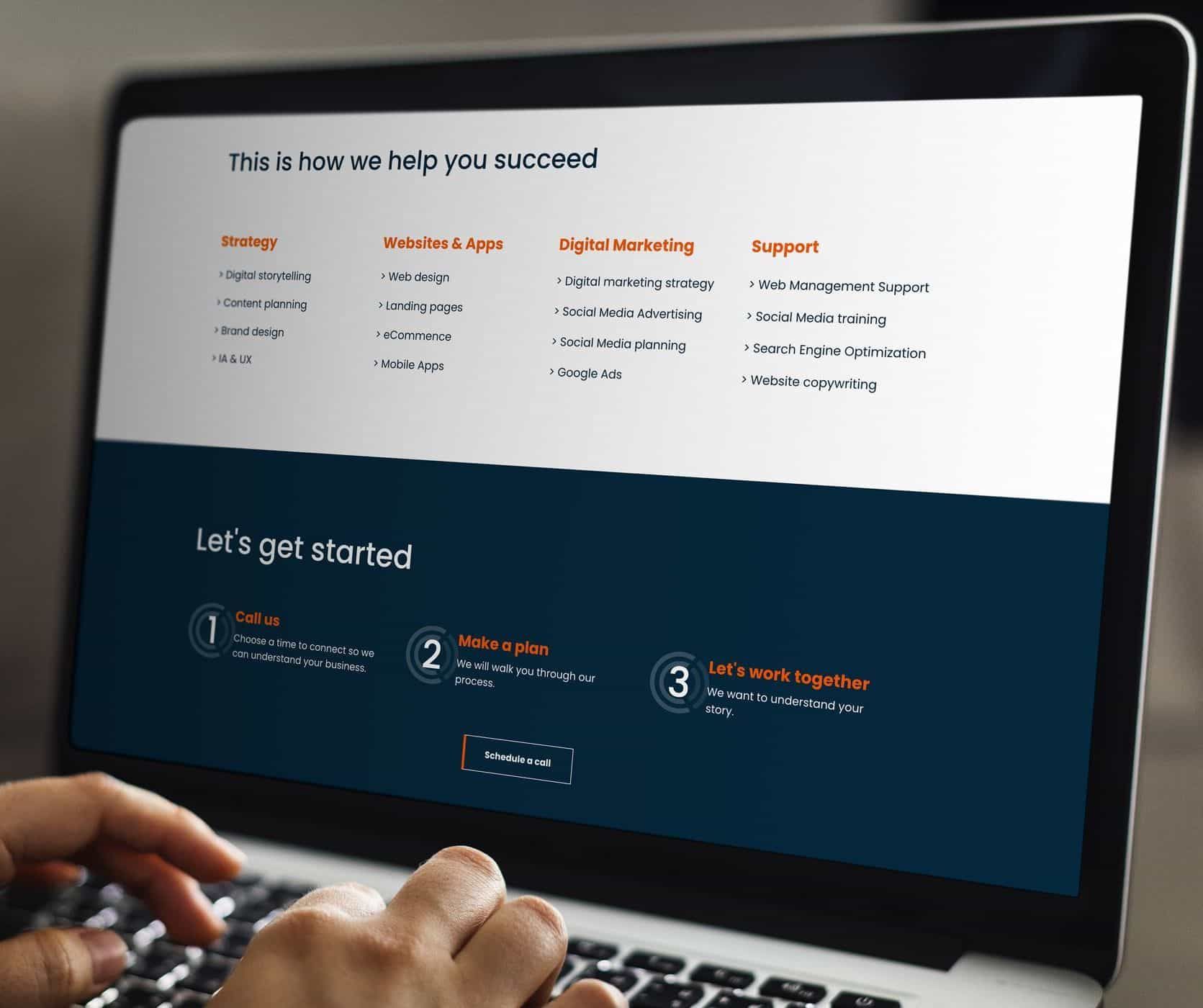
Digital strategy – research, user testing and competitive intelligence
- Content and information architecture
- Functions and features
- Web design trends
- Marketing and promotions
- Mobile experiences
What do we mean by heuristics? We mean measuring something subjectively when it can’t be readily quantified. For example, in a 100m swimming race the winner is easily identified by the fastest swimmer (there’s hard data to support that). In synchronised swimming it’s more difficult; the winner is determined by a set of technical and artistic abilities. The latter applies here. In this instance, we looked at heuristics such as design, layout, functionality and usability. Measuring those against the 5 categories above. Using this analysis, we were able to conduct a very clear strategy for both the information architecture (arrangement of content pages and categories) and user experience design.
Design and development – a mobile first approach for 80% of visitors
Analysis of the existing website told us that 80% of people visit the DIA website on their mobile, 10% are on tablet and only 10% are on desktop. With figures like that, we knew we needed to build for mobile first. Many companies talk about being ‘mobile ready’ or ‘mobile friendly’ with their websites but not nearly as many actually design and build around mobile and make it work for desktop. And it’s really important. Think about when you’re on your mobile, looking at a website’s burger menu and the navigation items don’t make much sense or work as fluently as they should. Or when you’re scrolling through a text heavy website and can’t find what you’re looking for easily. Or when there’s so many pages on a website you don’t know where to start. Clear navigation for all devices really was top of mind for us during this project. In terms of design, we aimed for three main things. First, add more imagery and make images bigger. Second, add more people in images. Third, use icons to help navigate each section of the site. In terms of development, one particular feature that we’re immensely proud of is DIA’s flight feed. The feed fetches live data (if we’re going into specifics, the software pulls in new data every 2 and a half minutes) and the search functionality is truly user friendly; you can search by airline, by flight number, by origin or destination, by flight time and by flight status. Our development team worked closely with DIA’s IT personnel and third party software supplier Intersystems to make this work.
Content – strategy, audit, copywriting and editing
We worked closely (and by worked closely I mean worked onsite for 4 months part-time) at DIA to support their content strategy. By being onsite with DIA’s media and communications team, we could optimise the content layout (scrollable sections, more headings, using drop downs to make content neater etc), we could improve content from an SEO perspective and organise content approvals from various departments and make requested amendments. One of the main things we wanted to achieve with content was to reduce the number of pages on the site. Of course this makes navigation easier for everyone, but mobile users in particular will want to see fewer pages and will use anchors to scroll through the site. We hope you like the look of the site as much as we’ve enjoyed making it. If you’re after a powerful website just like this one, get in touch.